Data visualization has the power and potential to unleash trends and patterns that cannot be understood otherwise. Visualizing data through charts and graphs gives a clear presentation of important data points, milestones, trends, thus simplifying the process of forecasting and decision making.
MongoDB Atlas, the cloud developer data platform provided by MongoDB, provides various types of visualizations through charts. It provides filters, aggregations and much more that you can use to build charts from your Atlas collections and embed them into your applications and dashboards.
How to access MongoDB Charts
To use charts, you should have an Atlas account. You can create a free cluster using your google account. Once you are logged in, you can load the sample dataset and try out some of the features of MongoDB Charts.
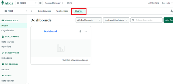
To add charts, go to your dashboard (click on Dashboard) and then add a data source.
By default, you can use the Sandbox cluster, which has the sample dataset. You can choose the database and the collection for which you want to create the charts.
For example, let us take the sample_mflix database and the movies collection within the database. On selecting the data source, MongoDB Charts automatically lists the fields present in the collection. It also gives options for selecting the chart type, filters and other customizations.
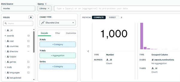
Working with MongoDB Charts
Let us say we want to see the genre of films made in each language. We can place the genre on the X-axis and languages on the Y-axis. Note that MongoDB gives the option to unwind and get values from an array. You can choose to get the sum, count, mean, minimum and maximum value of a field.
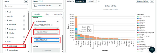
The chart type we have chosen for the example is a stacked column, as it includes many languages for the same genre of movies.
If you hover over a particular color in the chart, you can see the corresponding values.
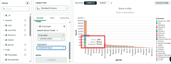
All the work of colors, sorting, grouping is done by MongoDB charts within a few seconds of dragging and dropping the X and Y axis values.
MongoDB also provides an option to limit the number of results to the first few (in our case genres), where you can choose the number of columns you want to show.
.png)
You can add/edit the title and description of a chart on the top right of the chart area:
.png)
Filters tab
You can also set filters to get the documents based on a particular criteria. To add filters, move to the ‘Filters’ tab (next to the Encode tab).
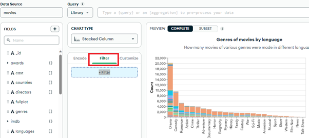
You can drag any filter that you want. Suppose, we want to see how many movies of different languages and genres are released in Australia. We can filter the chart by the “countries” field. Again, since this is an array, you can unwind the array by value and get the correct count. Note that you can select more than one country too, by checking the checkbox.
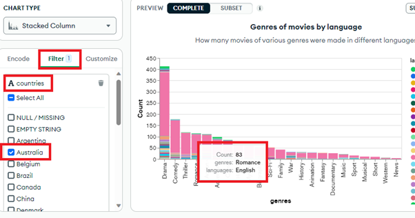
When you hover over the chart, you can see the exact count of documents present for the corresponding language, genre and country.
We can also add more than one filter using the filter tab.
So, let’s filter the data by the year field and get the count of movies released in Australia in all genres and languages between 2003 and 2006.
By default, the ‘inclusive’ checkbox is checked which means both 2003 and 2006 movies are also included in the result, however you can uncheck those to exclude these 2 years.
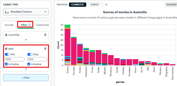
MongoDB also shows the number of filters that you have applied.
Let us now try a different chart type.
Let’s try to find out how many movies of each genre were released in Australia between 2003 and 2005. For this, we can use a Discrete line as it is a good option to compare data of different years. So, our X-axis will be the movie genre, the y-axis will show the number of movies in that particular year of the particular genre, and in filters we will add the country and the year range:
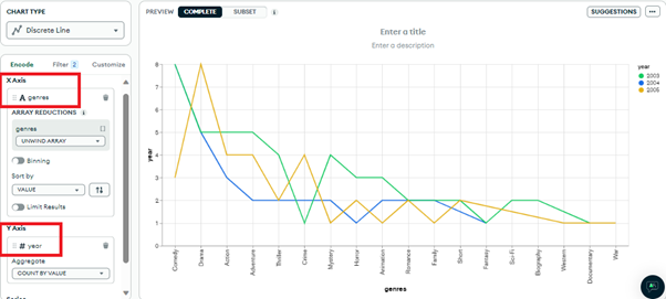
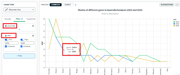
As always, hovering over the chart gives you the exact data.
From this chart, you can compare the values of each year. For example, only 3 comedy movies were released in Australia in 2005 as opposed to 5 in 2003. Well, in 2004, no comedy movies were released!
While this is a simple example, this type of information can be crucial for sales data, healthcare, marketing and many other domains, where we need to compare data yearly, monthly, quarterly, weekly or even daily!
MongoDB Charts can prepare this data in a very less time - almost as you change the input parameters, the charts get displayed! This can save a lot of time and effort of writing queries for getting the same data. Further, for presentations to business analysts and stakeholders, visual data could prove more useful than running queries for each use case.
Another interesting and popular chart type is the heatmap, which displays the intensity of a parameter in a particular region/place. For example, the population of Hindi speaking people in India vs any other country.
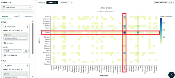
Let us create a heatmap showing different movie genres (Y-axis) in various languages (X-axis) released in India (filter).
Notably, Hindi (particularly drama) is the darkest (most released), followed by English, and other regional languages like Tamil, Telugu, Marathi, Bengali and Urdu.
Let us filter with another country, say China, where Mandarin documentaries are the most released, followed by English and Cantonese.
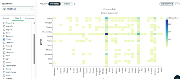
Heatmaps are a great way to view data that stands out from others. Within a second, we are able to find out the most released movies in a particular country, language and genre. This can help us to find out the preference of people in that region.
MongoDB Charts display this information within a fraction of seconds, by searching through millions of records from the database collection, which would take a lot of time otherwise. It also saves the coding time for developers, and is a great option for those who do not know coding - like business analysts, stakeholders and administrators.
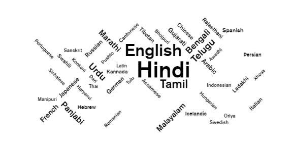
You can also create a nice word cloud to view the same information in text format, but a more concise one:
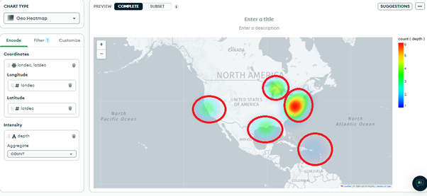
As we know, MongoDB can store different types of structured and unstructured data, which includes the location information, like longitude and latitude coordinates. This information, when presented on a map, is useful for logistics, finding missing vehicles, traffic management and much more.
We can use the geo heat map chart type, to demonstrate the visualization of geospatial data.
Let us use the shipwrecks collection from sample_geospatial database and find the distributed remains of wreck across the US region, where depth of wreck is known. We can plot the data using the coordinates and the depth with the feature type as the filter.
Customize tab
Before concluding, let’s also see what the customize tab in MongoDB Charts has in store!
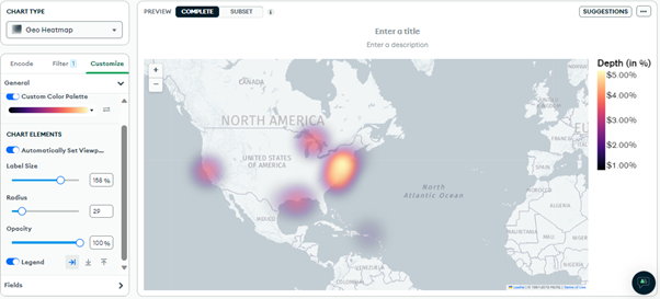
The customize tab has two options, General and Fields.
General
With this option, you can change the color palette of your maps to suit your branding or color preferences. You can also change the size of your labels, opacity, change the placement of the legend and so on.
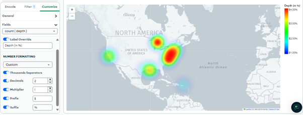
Fields
With the fields option, you can also customize the labels for field names, add prefixes (like a $ symbol), suffixes (like cm), decimals, multipliers and much more.
Every map you create can be saved to your dashboard, by clicking on the Save and Close button given on the top right of the page.
Once you save the map, you can view it in your dashboard:
Embedding MongoDB Charts
You can embed MongoDB Charts by clicking on the chart you want to embed from your dashboard.
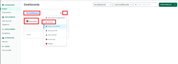
You can then follow the steps given in the MongoDB documentation for embedding charts to set it up for your application. Conclusion MongoDB Charts are a great way to visualize data, derive actionable insights and speed up decision making. You can create dashboards with charts, share with anyone, collaborate and provide real-time analytics of your data. You can also export/import dashboards, so that they can be reused for any other projects too!


